
https://www.fontshop.com/superfamilies/ff-real
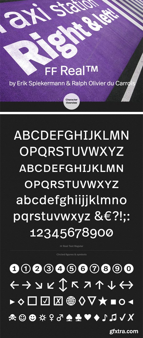
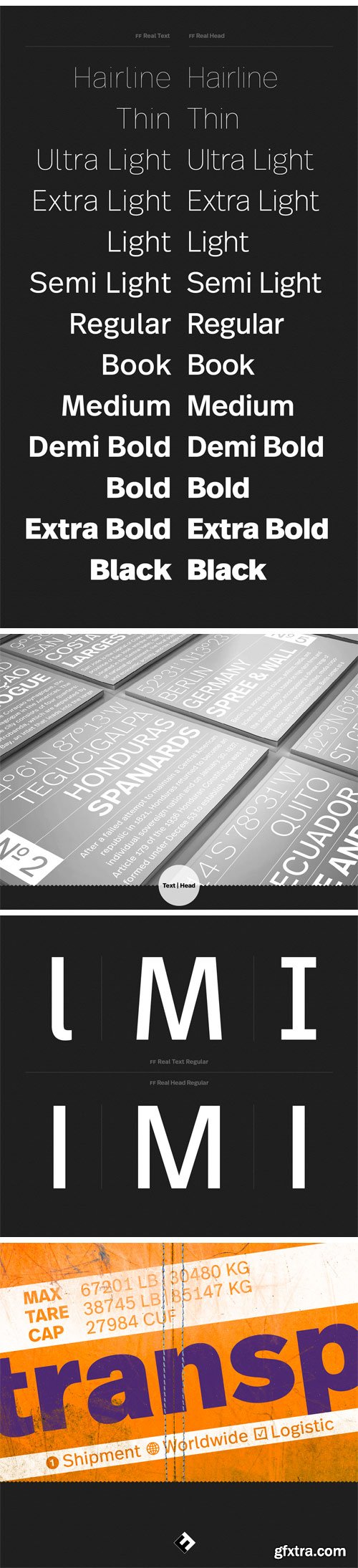
FF Real was originally conceived by Erik Spiekermann as one text weight and one headline weight to be used as the only faces in his biography Hello I am Erik, edited by Johannes Erler, published in 2014. While Spiekermann drew the alphabets, he passed on the font data to Ralph du Carrois who cleaned it up and completed it. In the meantime FF Real has been extended to a family of two styles and 13 weights each. The design of FF Real is rooted in early static grotesques from the turn of the century. Several German type foundries – among them the Berlin-based foundries Theinhardt and H. Berthold AG – released such designs between 1898 and 1908. The semi-bold weight of a poster-size typeface that was lighter than most of the according semi-bolds in metal type at the time, gave the impetus to FF Real’s regular weight. In the words of Spiekermann, the historical example is “the real, non-fake version, as it were, the royal sans serif face“, thus giving his new typeface the name “Real” (which is also in keeping with his four-letter names, i.e. FF Meta, FF Unit). FF Real is a convincing re-interpretation of the German grotesque style, but with much more warmth and improved legibility. With a hint towards the warmer American grotesques, Spiekermann added those typical Anglo-American features such as a three-story ‘g’ and an ‘8’ with a more defined loop. To better distinguish characters in small text sizes, FF Real Text comes in old style figures, ‘f’ and ‘t’ are wider, the capital ‘I’ is equipped with serifs, as is the lowercase ‘l’. What’s more, i-dots and all punctuation are round. In Spiekermann’s biography FF Real Text has proven to endure all challenges of a proper text face without an italic, while FF Real Head cuts a fine figure in larger sizes with a more reduced look.
OTF | 26 Fonts | 2.7 Mb RAR

http://www.myfonts.com/fonts/fontfont/hydra-text/
OTF | 16 Fonts | + JPG Preview

http://www.myfonts.com/fonts/fontfont/ff-info/
German type designers Erik Spiekermann and Ole Schäfer created this sans FontFont between 1996 and 2000. The family has 10 weights, ranging from Regular to Bold (including italics) and is ideally suited for book text, editorial and publishing, small text as well as web and screen design. FF Info Text provides advanced typographical support with features such as ligatures, small capitals, alternate characters, case-sensitive forms, fractions, and super- and subscript characters. It comes with a complete range of figure set options – oldstyle and lining figures, each in tabular and proportional widths. In 1998, FF Info Text received the The Big Crit award.
OTF | 70 Fonts | + JPG Preview


CreativeMarket - Brand Manual - REAL TEXT 4604201
JPG, DOC, PDF, PNG, INDD


CreativeMarket - Brand Manual - REAL TEXT 4653146
JPG, DOC, PDF, INDD


CreativeMarket - Brand Manual Real Text 4835846
JPG, DOC, PDF, INDD
CreativeMarket - Brand Manual 48 Pages - REAL TEXT 4229788
DOC, PNG, PDF, INDD
SermonBox - Seasonal Collection

SermonBox - The Series Pack Collection

Top Rated News


Would you like to be a Author?


